Creating a Child Theme
How to create a child theme
In the design manager, you can create a child theme - a copy of a purchased theme - based on a purchased Asset Marketplace theme or a default HubSpot theme.
Developers can also create child themes based on custom themes and create child themes using the CLI using our developer documentation. Learn more about working with child themes.
- In your HubSpot account, navigate to Marketing > Files and Templates > Design Tools.
- In the finder, click the @marketplace folder for Asset Marketplace themes or the @hubspot folder for default themes.
- Right click a theme folder, then select Create child theme.
- In the dialog box, enter a name for the child theme.
- To change where the child theme will be saved, click Change in the File location section. Click a folder, then click Select.
- To customize the names of the theme's CSS and JS files, click Advanced options, then enter new file names in the CSS and JS fields.


To finish the process, click Create child theme. You can edit the styling for the child theme in the content editor.
Theme Updates
How to update the theme
When you update to the latest version of a template or module, a new version of the template or module will be created in your account. This ensures that any customizations that you've made to the template or module don't get overwritten automatically.
To update to the latest version of a template or module:
- In your HubSpot account, click the Settings icon in the main navigation bar.
- In the left sidebar, click Marketplace Download.
- Hover over your purchased product and click Install update.


For themes, HubSpot will overwrite upon update. If you're using a module and it gets updated, your page will pull in the new version. However, if you are using a module and that module doesn't exist in the new version, we do not delete it from your HubSpot account.
Theme Style Settings
Global modules and background colours
In the edit themes settings, you can apply a primary, secondary, and background colour to all elements included in the Nexus theme.

To adjust primary and secondary colours of all elements in all Nexus theme-based pages, click on Global Background Colour.

Click the color bubble to customize your primary or secondary colors. You can choose a simple color value or click the Advanced tab and choose a specific hexadecimal value with a color picker.
Please note: Modules use primary color (like indigo, blue etc.) and secondary color (gray) and numeric scale (where 50 is light and 900 is dark) by default. You can generate colors by using material palette generator or any free color palette generator online.
Theme Style Settings
Global typography
In your typography settings, you can control the fonts applies to certain elements in your templates. All Google fonts are supported. You can also select custom colors for certain headings, fonts, or links in your theme.
- Headings: you can customize the exact font, color, size, and style for any headings included on your theme.
- Body: customize the font, color, or text size of the body of your page only.
- Links: customize the default color of links on your website. You can also customize the color and behavior of links when a visitor hovers over or clicks your link.

If you need fonts that are not included in the Google fonts, you can enable the use of custom fonts and configure it via page editor > Contents tab > click Custom Font > Open in global content editor.

Theme Style Settings
Global forms
Customize the default colors, fonts, and text styles, and buttons styles for your forms.
- Title: these are styles applied to the text field that appears above your entire form. This typically includes a greeting and instructions for completing the form. These styles on your form can only be managed here in your theme's settings.
- Labels: styles applied to the labels that appear above a form field.
- Fields: styles applied to the names of the form fields themselves.
- Help text: this is the sample content that appears inside each form field, indicating what type of information your visitor should submit.
- Submit: choose which button style and size should be applied to your forms.
- Background color: the background color applied to your form.
- Border: the border color around the form fields.
- Padding: the amount of spacing around the form on your page.
To adjust the global forms in all DigiHub theme-based pages, click Global Forms.

Theme Style Settings
Global buttons
You can set custom colors, fonts, and styles for buttons on your pages and blog. Within the page editor for a specific page, you may be able to swap button sizes or types, depending on how your theme was created by your website developer.
- Size: specify the dimensions of small, regular, and large buttons on your page.
- Primary: a primary button is for the most important action a visitor takes on your page. This color should stand out and catch your visitor's attention.
- Secondary: a secondary button is used for relatively less important actions when there's already one primary button on your page. Secondary buttons are typically applied to pages for lower priority actions.
- Simple: these are the default fonts and styles applied to simple button modules in your page.
To adjust the global forms in all DigiHub theme-based pages, click on Global Buttons.

Theme Style Settings
Global scroll animation
Motion helps make your website more compelling. With the Animations on Scroll module, you can animate elements on any of your HubSpot web pages without any knowledge of JavaScript. Work directly in the page editor instead of having to go to the design manager, saving you time and making it easier for anyone to add moving elements to your pages.
To adjust this, go to Global Scroll Animation.


Global Header
How to adjust the global header?
Your navigation menus will include the most important pages that your website visitors will want to access quickly or frequently while browsing your site.
In the header settings, you can select which header to use on your website or landing pages.
Please note: Landing pages do not have a navigation menu. Several studies reveal that removing links from landing pages increases conversion rates.
Website pages
- Hero Section 1: Navigation Without Dropdown

- Hero Section 2: Navigation With Dropdown

- Hero Section 3: Navigation Without Dropdown

Landing Pages
- Hero Section 1: No Navigation Landing Page

- Hero Section 2: No Navigation Landing Page

- Hero Section 3: No Navigation Landing Page

Global Header
How to customize the global header?
- Navigate to your content:
- Website Pages: In your HubSpot account, navigate to Marketing > Website > Website Pages.
- Landing Pages: In your HubSpot account, navigate to Marketing > Landing Pages.
- Blog: In your HubSpot account, navigate to Marketing > Website > Blog.
- Hover over your content, then click Edit.

- In the content editor, click the global content. It will be labeled with a global content icon.
- In the dialog box, click Open in global content editor.

- To preview the global content in specific content, click the View on dropdown menu at the top of the page and select a page or post where the global content is hosted. To view the global content by itself, select Group only instead.
- In the left sidebar under the Content tab, you can customize the logo, menu and sub-menus, menu buttons, etc.

- In the left sidebar under the Styles tab, you can customize fonts, backgrounds, buttons, etc.
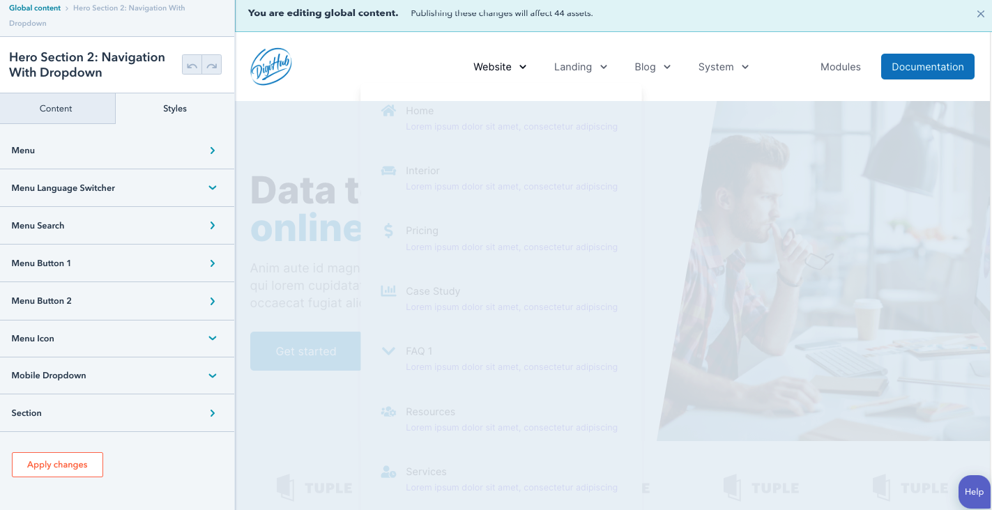
- When you're done editing global content, click Publish to [X] assets in the upper right. These changes will be applied to all pages and blog posts using a template that includes this global content.
Global Footer
How to adjust the global footer?
In the footer settings, you can select which footer to use on your website or landing pages.
Website pages
- Footer Section 1: 4-Column With Company Mission

- Footer Section 2: 4-Column With Newsletter and Localization Dark

- Footer Section 3: 4-Column With Newsletter
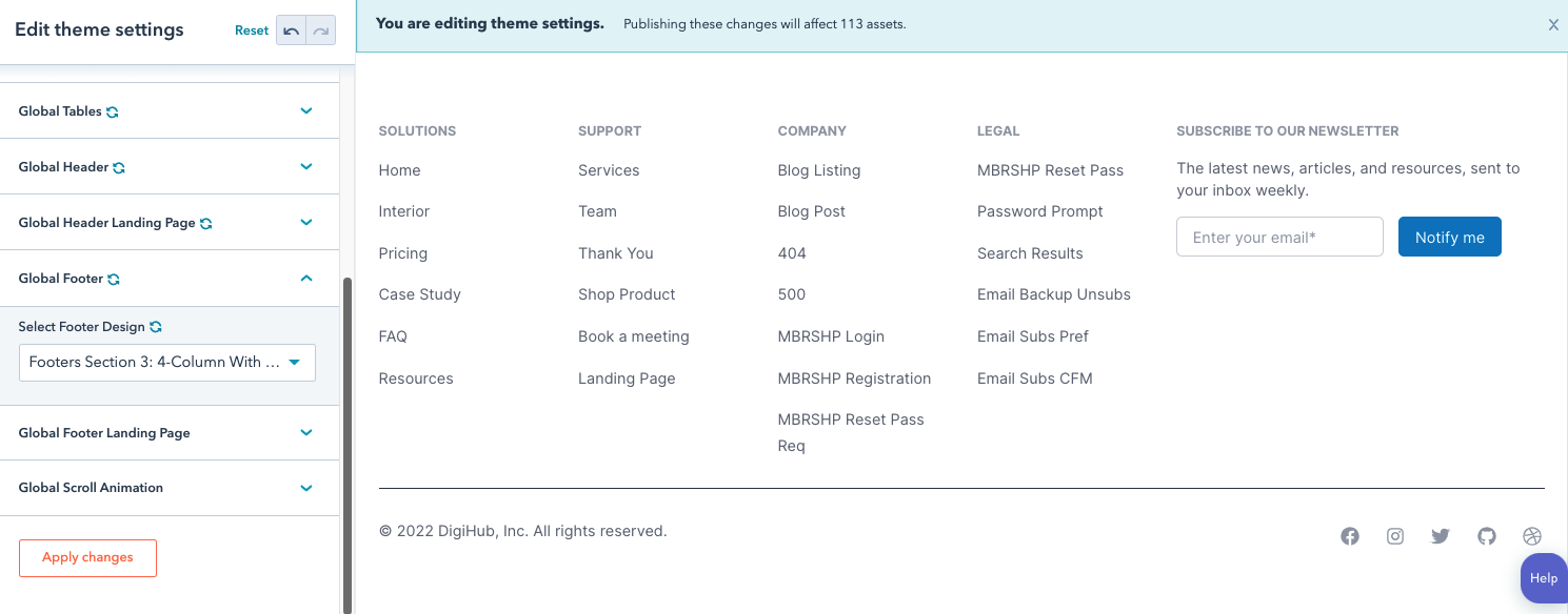
- Footer Section 4: Simple Centered

Landing Pages
- Footer Section 1: Landing Page

- Footer Section 2: Landing Page

- Footer Section 3: Landing Page
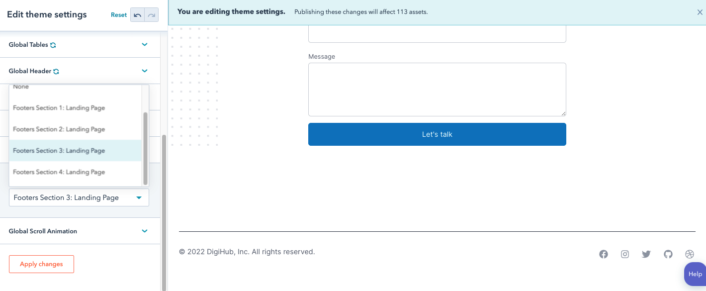
- Footer Section 4: Landing Page

Global Footer
How to customize the global footer?
- Navigate to your content:
- Website Pages: In your HubSpot account, navigate to Marketing > Website > Website Pages.
- Landing Pages: In your HubSpot account, navigate to Marketing > Landing Pages.
- Blog: In your HubSpot account, navigate to Marketing > Website > Blog.
- Hover over your content, then click Edit.

- In the content editor, click the global content. It will be labeled with a global content icon.
- In the dialog box, click Open in global content editor.
- To preview the global content in specific content, click the View on dropdown menu at the top of the page and select a page or post where the global content is hosted. To view the global content by itself, select Group only instead.
- In the left sidebar under the Content tab, you can customize column menus, social links, etc.

- In the left sidebar under the Styles tab, you can customize styling for menu, backgrounds, social, etc.

When you're done editing global content, click Publish to [X] assets in the upper right. These changes will be applied to all pages and blog posts using a template that includes this global content.
Blog
How to choose blog templates?
- In your HubSpot account, click the settings icon in the main navigation bar.
- In the left sidebar menu, navigate to Website > Blog.
- In the Current View section, click the first dropdown menu and select a blog
- On the Templates tab, you can view or change the templates applied to your blog posts and blog listing page. You can also customize your listing page set-up and add custom HTML to your templates' header and footer.
- In the Blog post section, click the Actions dropdown menu to manage your blog post template:
- Select Change template to choose a different template. On the template selection screen, select your new template, then click Done. In the bottom left of your template settings, click Save.
- Select Edit to edit your template in the design manager. Learn more about editing a blog post or listing template.
- Select Preview to see what your template looks like.

- In the Blog listing page section, you edit a blog listing page or customize its settings:
- Click Edit page to open the listing page in the content editor.
- Click the Actions dropdown menu and select Preview to preview the page on different devices.
- Click the Actions dropdown menu and select Details to view the listing page's performance data.
- In the Number of posts per listing page field, enter the number of posts you want to appear on your listing page. Click Save in the bottom left to save your changes.
- To display the content of blog posts up to the Read More separator on your listing page, select the Show summaries on listing page checkbox. Click Save in the bottom left to save your changes.
- To display the featured images of your blog posts on your listing page, select the Use featured image in listing summaries checkbox. Click Save in the bottom left to save your changes.

System Pages
How to apply your system templates in your settings?
Select your error and password prompt page templates:
- In your HubSpot account, click the settings settings icon in the main navigation bar.
- In the left sidebar menu, navigate to Website > Pages.
- Click the System Pages tab.
- Click the corresponding dropdown menus to select your 404 error page, 500 error page, Password prompt page, and Search results page templates.

- When you're done, click Save in the bottom left.
Select your email subscription page templates
- In your HubSpot account, click the settings settings icon in the main navigation bar.
- In the left sidebar menu, navigate to Marketing > Email in the left sidebar menu.
- Click the Subscriptions tab.
- Click the corresponding dropdown menus to select your Subscription preference page, Unsubscribe backup pages, and Subscription update confirmation page templates.

- When you're done, click Save in the bottom left.
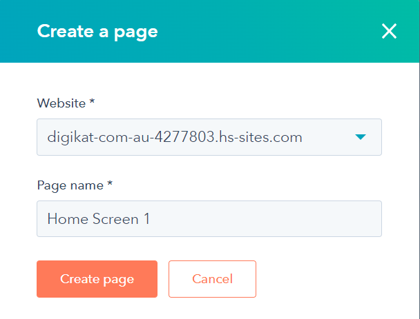
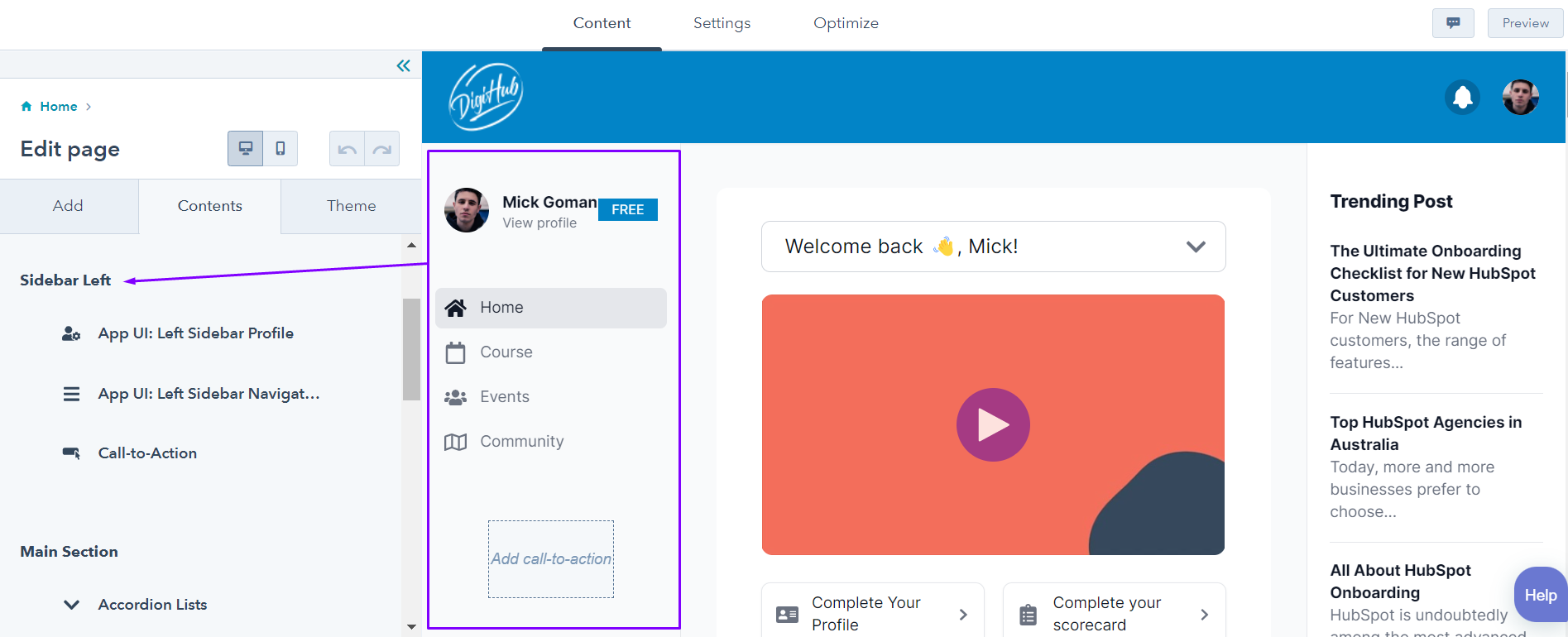
Home Screen 1
Create pages
-
Navigate to your content:
- Website Pages: In your HubSpot account, navigate to Marketing > Website > Website Pages.
- Landing Pages: In your HubSpot account, navigate to Marketing > Landing Pages.
- In the upper right, click the Create dropdown menu and select Website page or Landing page.
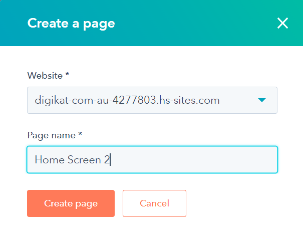
- In the dialog box, specify a name and domain for the page:
- Click the Website dropdown menu and select a domain for the page's URL. If you don't have any connected domains, your account's default domain will be the only option.
- In the Page Name field, enter an internal name for the page.
- Click Create page.
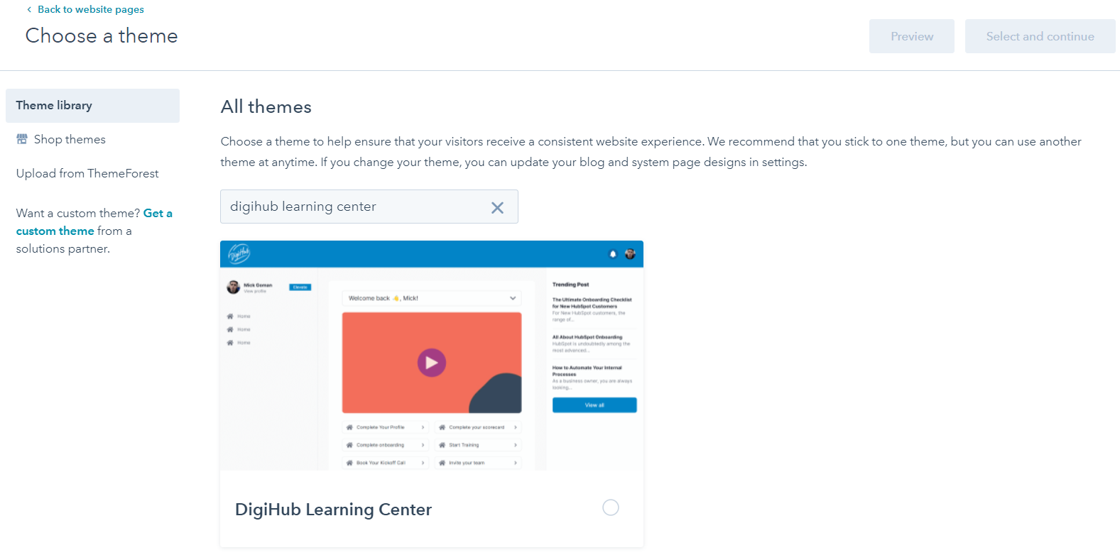
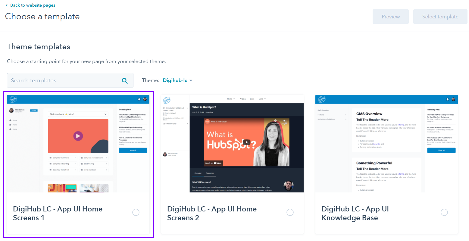
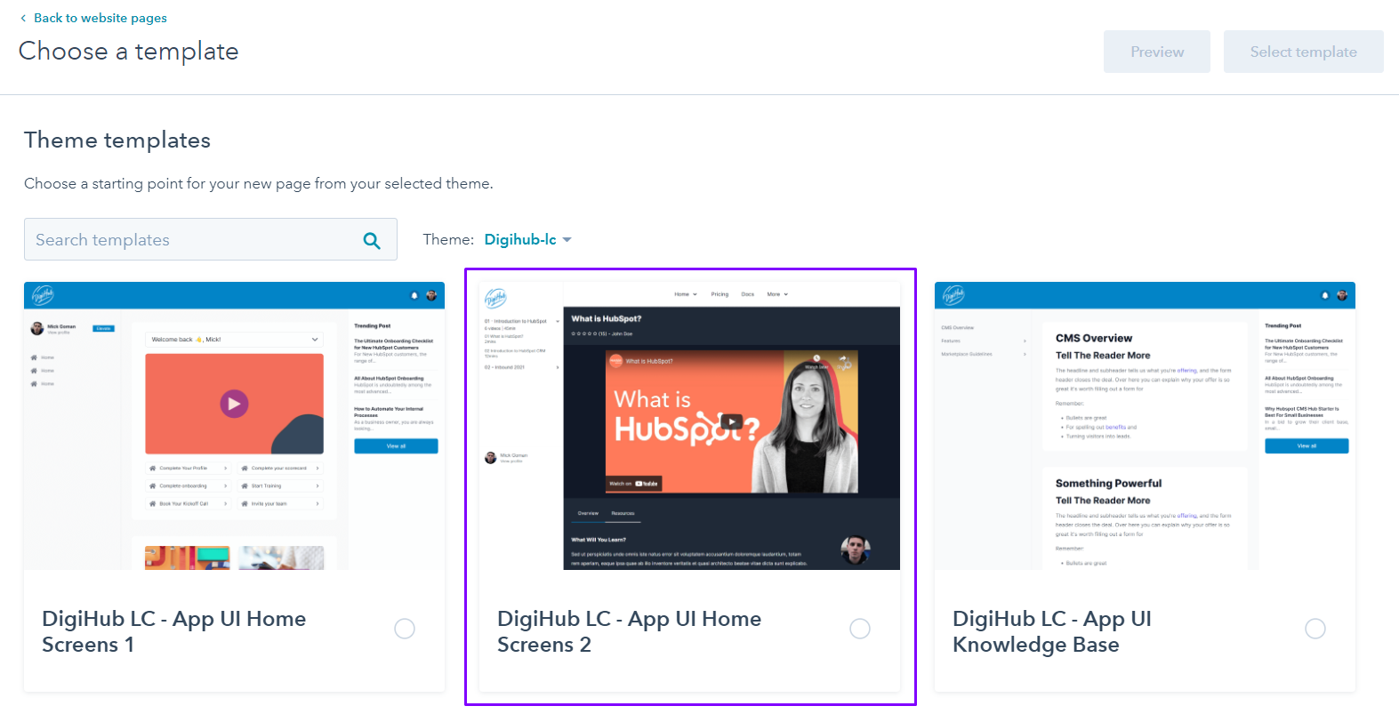
- On the template selection screen, templates from your active theme will appear at the top of the page, while all other templates will be in the Other templates section at the bottom. Click a template. If you haven’t selected an active theme, you’ll be prompted to select one or click Skip to templates to pick an existing template.
- To create the page with the selected template, click Select this template in the top right. To preview the page on mobile or desktop, click Preview.
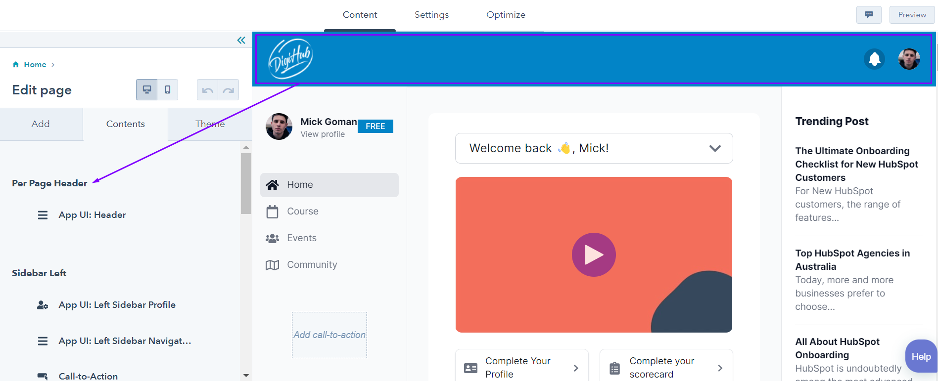
- Once you’ve selected a template, you’ll be brought to the content editor. The editing options available depend on the page's template type and modules used. Learn more about editing pages using starter or theme templates, global content spanning multiple pages, drag and drop areas, and rich text or image modules.

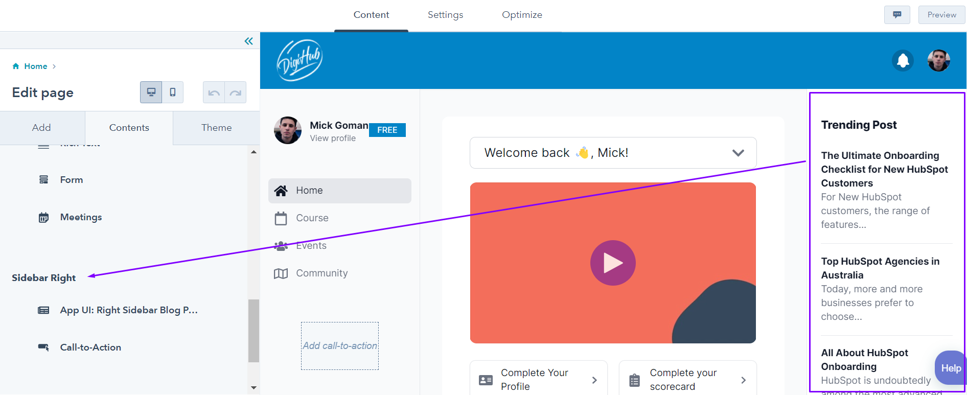
Home Screen 2
Create page
-
Navigate to your content:
- Website Pages: In your HubSpot account, navigate to Marketing > Website > Website Pages.
- Landing Pages: In your HubSpot account, navigate to Marketing > Landing Pages.
- In the upper right, click the Create dropdown menu and select Website page or Landing page.
- In the dialog box, specify a name and domain for the page:
- Click the Website dropdown menu and select a domain for the page's URL. If you don't have any connected domains, your account's default domain will be the only option.
- In the Page Name field, enter an internal name for the page.
- Click Create page.
- On the template selection screen, templates from your active theme will appear at the top of the page, while all other templates will be in the Other templates section at the bottom. Click a template. If you haven’t selected an active theme, you’ll be prompted to select one or click Skip to templates to pick an existing template.
- To create the page with the selected template, click Select this template in the top right. To preview the page on mobile or desktop, click Preview.
- Once you’ve selected a template, you’ll be brought to the content editor. The editing options available depend on the page's template type and modules used. Learn more about editing pages using starter or theme templates, global content spanning multiple pages, drag and drop areas, and rich text or image modules.

Tips and Tricks
Understand the drag and drop editor
Drag and drop areas are composed of modules, which are blocks of website content. Modules can be arranged in horizontal rows or vertical columns, which can then be grouped into sections.
By creating rows, columns, and sections, you can rearrange or apply styling to multiple modules at once. Learn more about customizing styles for drag and drop content.
- Module: an individual block of website content. Some modules, like rich text modules, can contain multiple types of content.
- Section: a group of multiple rows or columns that covers the full width of the page. You can apply styling to an entire section or rearrange its position on a page. Sections can be used on any page that supports drag and drop editing. Saved sections that contain smart rules will use these rules when added to a page.

Tips and Tricks
How to add and edit a section?
- Navigate to your content:
- Website Pages: In your HubSpot account, navigate to Marketing > Website > Website Pages.
- Landing Pages: In your HubSpot account, navigate to Marketing > Landing Pages.
- Hover over a page and click Edit.
- In the content editor, hover between two sections and click the + plus icon.
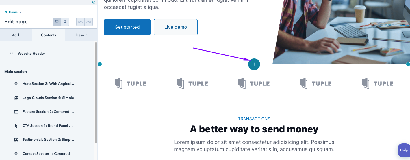
- In the right panel, hover over a section and click Select.
- Sections saved from the drag and drop editor will appear under Saved sections, while the purchased theme will appear under Theme sections.

- In the page editor, hover over the section, then click the edit edit icon.

- To customize padding and margins around the row, column, or section, click Alignment and spacing in the sidebar editor.

- To edit an area's background, click Background in the sidebar editor and select a styling option

- To edit the content and styling, hover over and click the section.
Tips and Tricks
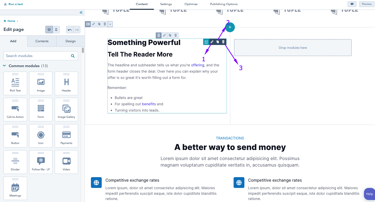
How to add and edit modules?
-
Navigate to your content:
-
Website Pages: In your HubSpot account, navigate to Marketing > Website > Website Paes.
- Landing Pages: In your HubSpot account, navigate to Marketing > Landing Pages.
-
- Hover over a page and click Edit.
- In the content editor, click the module in the sidebar editor, then drag it into position on the page.

- To adjust the width of a module, click the vertical divider between columns and drag it into position.
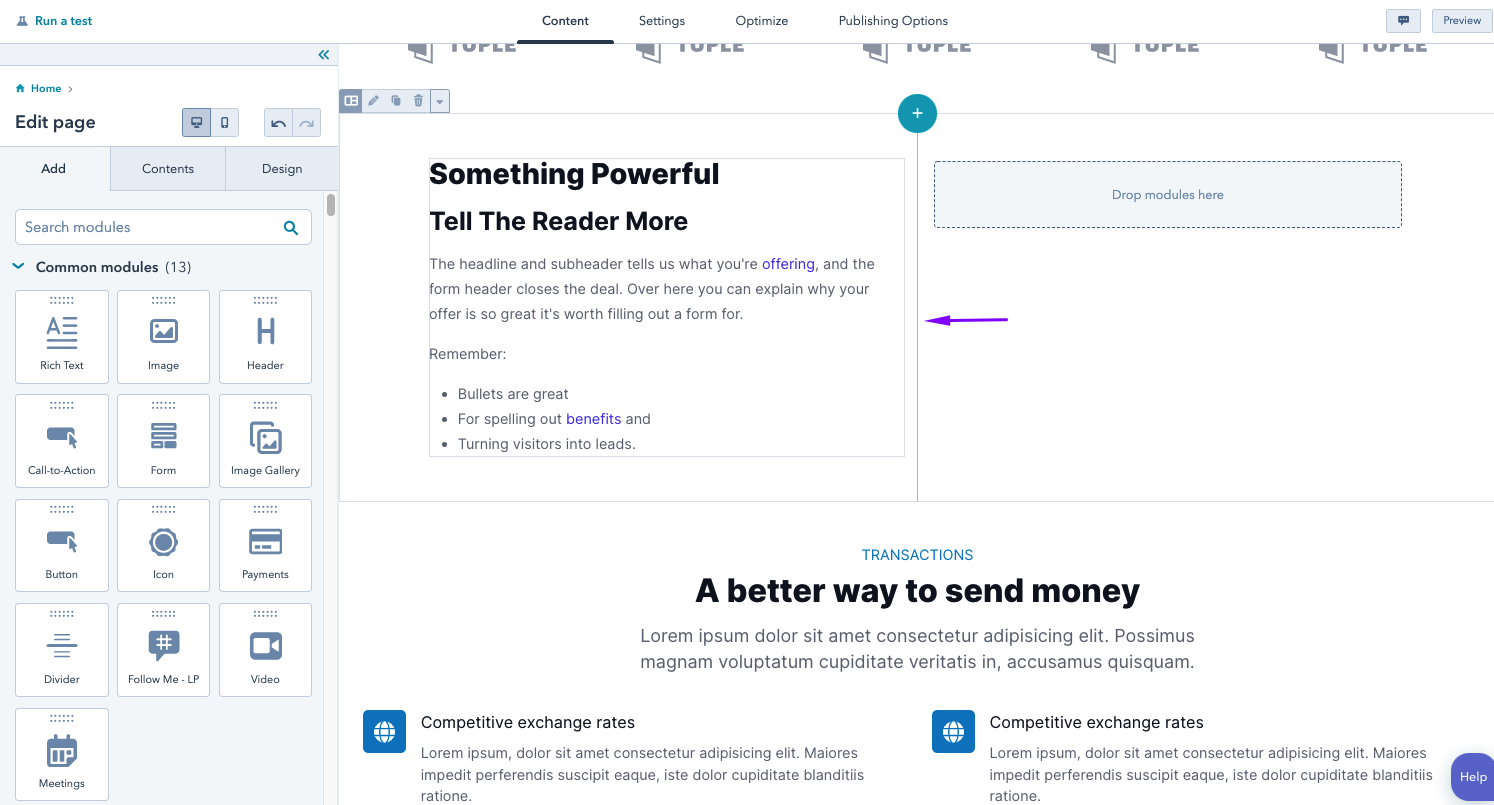
- To customize content within a module, hover over the module and click an icon:
-
- Edit module: edit the contents of the module
- Clone module: make a copy of this module on the page.
- Delete module: remove this module from the page.